Case study · Bonify
Making sense of your own finances
Overview
Bonify is a German fintech that gives people access to their own credit data, known mostly for the credit report tenants need before renting a home. The brief was to transform it into an all-in-one personal finance app: bank transactions, spending patterns, and credit records in one place. I led the six-member design team across the eight-month redesign.
Germany runs on cash, and its people deeply distrust putting financial information online. Bonify needed them to share all of it.
How can an app that asks for your bank data and your credit records earn that trust, screen by screen?
Working in the room
Projects generally begin with discovery. This one did not. Stakeholder availability was limited, and many compliance nuances were easier to point out on a sketch, so we reversed the order.
We brought all eight to ten stakeholders into one room. They walked us through each module: how it worked, where behaviour broke down, their goals, where their hands were tied. As they spoke, I sketched working layouts, and an hour of discussion around them settled many of the immediate design questions. Assumptions got named. Ideas got challenged.
The welcome and onboarding screens.
We took the sketches back, refined them, and layered in secondary research and customer-support insights: a competitor analysis of the German personal finance and credit landscape, user archetypes, and journey maps of each archetype’s emotional arc through the product.
This cycle ran two to three times over eight months. The designs came out clearer, with fewer feedback loops, closer to final, because every screen began in a room where every stakeholder had to react to something real.
Trust came before features
The central design challenge was trust: winning it from a cautious user base while navigating heavy compliance. The app is built around data from Schufa, Germany’s dominant credit agency, which had recently acquired Bonify, and most Germans encounter Schufa only when something has gone wrong: a rejected rental application, a loan that did not come through.
The product ran on constant user permissions and upfront input; it could show nothing meaningful until a user chose to trust it with their financial information. Every important feature needed data the user had not yet provided: bank information, Schufa consents, identity verification. Without it, first-time users would open the app to mostly empty screens.
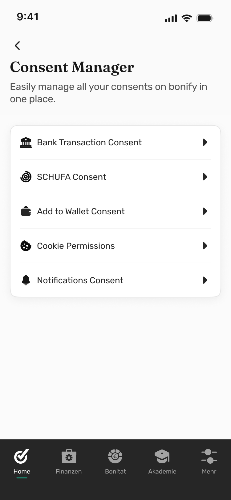
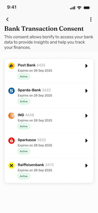
Consent Manager: transparency and control over where and how information is used.
The people we had profiled were already cautious about sharing financial information online, and the app came from an institution most had encountered only in negative circumstances. So we designed for the empty screens directly: preview states and sample data showed what each section would become, and progressive disclosure kept each ask small, made only when a feature needed it.
Every permission request explained what was asked, why, and what would happen to the data. Legal consent texts came paired with plain-language summaries, and each verification step said what it unlocked.
KYC identification and Schufa Basisscore.
We also reframed what Schufa meant inside the product. The research was clear: most Germans associated Schufa with being judged. The app presented the same data as your own financial record, which you had the right to see and understand.
Schufa Data Insights.
Two numbers, one picture
We conceptualised the product around two scores. The Schufa score comes from your credit history and reflects how lenders and landlords see you; most of our users had never seen it unless it had already gone bad, which the market research confirmed.
The FinFitness score is Bonify’s own measure. It reflects current behaviour instead of history, tracking four things that shape credit health: returned direct debits, household surplus, savings, and employment stability. Together they say what neither can alone: where you stand, why, and what to improve.
The FinFitness barbell.
The design problem was relating the two without making it feel complicated. We kept them as separate sections and connected them through education instead of a shared data view: within personal finance, we explained how spending and payment behaviour influence Schufa. Contractual and privacy constraints required the separation anyway; the design followed it.
The home dashboard, where both scores sit together. The full picture at a glance.
Where the line goes
The app had three pricing tiers, and deciding what belonged in each shaped much of the product design. The competitive landscape helped: most players either gave everything away with no clear business model, or locked core credit features behind a paywall users had no reason to trust yet.
We concluded that personal finance should be free: spending insights, budget tracking, the FinFitness score. These features grow more useful the longer you use them; gating them early would undermine the product.
Free and premium states across the product: the tier distinction communicated through the quality of the data itself.
Schufa-related capabilities became premium: real-time Schufa data, the negative entry scanner, score lock, and the digital tenant report (Mieterauskunft). People need these at a particular moment, and they cost money to provide.
The visual design had to communicate the difference without becoming a constant sales pitch, so the interface signals the tier: how polished each screen feels, how much information it carries, the quality of the data it shows.
Making the invisible legible
The negative entry was a problem worth its own feature: a record in your Schufa profile of a payment default or missed obligation, one that affects your score significantly and can sit there for years. Many users had entries they did not know about, or knew about but never fully understood.
Negative entries.
We introduced a Negative Entry Tracker: it surfaces active entries, explains each one, and shows when it expires and what can be done. The journey mapping had made this visible early: negative entries carry a weight well beyond the financial.
More coach than dashboard
From early on, we were working toward a product that behaves like a financial coach: one that suggests, flags, and explains.
The Finance Manager moved in that direction with an algorithm-driven insights layer: when spending crossed thresholds or unusual patterns appeared, the app surfaced a suggestion or flagged the trend. Building it required a detailed decision framework: which events trigger which responses.
The Finance Manager: spending broken down by category, with contextual insights surfaced when patterns shift.
Bonify was the most structurally complex project I have worked on: the product was ambitious, the user context difficult, and the process not one I would have chosen at the start. Still, working in the room, sketching against live conversation, produced a shared understanding a conventional sequence would have taken far longer to reach, and it changed how I think about process. Managing the team and coordinating daily output took clean planning and close communication, and I thoroughly enjoyed it.
“If you want to go fast, go alone. If you want to go far, go together.”
— African proverbThanks to Hardik and Abel Cherian, who worked with me on this.
“Working with Aishwarya on the Bonify project was a great experience. Her enthusiasm, confidence, and attention to detail stood out throughout the project. From workshops to interaction design and final handoff, she consistently delivered thoughtful solutions while being a fantastic collaborator. I highly recommend her.”
Hardik · Senior Visual Designer“I had the chance to work with Aishwarya at Bonify, where I was the UI designer and she led the UX side. One thing that always stood out was how deeply she understood the problem before moving to solutions. She asked thoughtful questions, never hesitated to challenge assumptions or dig deeper with clients to get the right context, and was always mindful of edge cases that others might overlook. That level of thoroughness made collaboration easy and consistently led to better product decisions. I’d gladly work with her again.”
Abel Cherian · Visual DesignerOther projects