Case study · Tattva Health
Designing calm on demand
Overview
Tattva Health is an early-stage wellness company pairing ancient breathwork and sound practices with real-time biometrics. I joined at preseed as brand strategist and product designer, and designed the app end to end: onboarding, practice sessions, data insights, and community.
We don’t have a healthcare problem, we have a self-care problem.
That is the founders’ conviction, and the product had to prove it: how can self-care be made measurable, so a busy, skeptical person can see it working?
Before a pixel, a point of view
This was a new company still finding its shape. Even the hardware that would read the biometrics was undecided: a watch, a ring, or a headband. Much of the early work was building a shared vision and vocabulary, so we started with a branding workshop to probe the founders and understand their expectations.
We mapped brand archetypes, ran a competitor analysis across the wellness and biometric landscape, and worked through the brand’s personality attributes with the founding team. Tattva sat in the gap between meditation apps, biohacking tools, and wellness retreats, evidence-led and built for people who had tried the alternatives.
The product’s first impression: the introduction video and early onboarding set up the visual language and the promise of what follows.
The workshops led into the design directions. We committed to keeping Tattva’s character visible: a product built on eastern philosophy for a Western market should look and sound like it, in naming, visual language, and tone.
With the brand direction settled, we moved to the product and its users with a UX workshop: opportunity mapping, proto personas, feature benefit analysis, and affinity mapping with the founding team. The user that kept emerging was pressed for time, skeptical of anything that could not show results, and trying to find a format for self-care that fit the pace of their day.
Goal setting and personalization during onboarding: the depth of the questions mirrors the specificity of what the product does after.
What the founders already knew
The founders were yoga practitioners and teachers, with years of retreats behind them, guiding practitioners into alpha states through a breathwork technique called VitalBreath. An alpha state is the brain’s relaxed-but-alert mode, associated with calm focus and flow. Their traditions hold that a person is more than a body; there are layers, physical, vital, mental, intellectual, spiritual, and each affects the others.
I spent time in yogic and eastern philosophy alongside the research to understand what each practice was doing: how breath moves mental state, and what changes in the body when it does. That understanding set what the product had to make visible.
The session experience: nature-inspired animations that respond to breath in real time, as read by the connected device.
Early ideation used state changes in nature to mirror the person’s change from disturbed to alpha, triggered by breath: a lotus blooming, a sun rising. We settled on a simpler direction that carried the retreat experience into the app: nature motifs that respond to breath in real time. The device reads your inhale, the animation opens with it, holds as you hold, and settles as you exhale.
The naming stayed Sanskrit throughout: Pranayama, Bhramari, Nadi Shodhana, keeping that character in the words themselves.
What moved, and by how much
After every session, the app shows exactly what changed.
Alpha wave ratio, HRV, respiratory rate: each marker is tied to the practice just completed, in plain language. The user should be able to see what happened inside the body, why it happened, and how this session compares to the last.
The design work here was about clarity: which metrics matter, how to explain them without overwhelming, and how the picture grows more useful as data accumulates.
Post-session readout: specific markers, in plain language, tied to the practice just completed and compared to previous sessions.
Built for between meetings
Wellness does not exist in isolation. Self-care has to be constant and targeted, so we built the product’s prompts within the user’s context of use, based on the personas. An alert tied to your actual calendar: your review is in 20 minutes, here is a 5-minute session calibrated for focus. We treated push notifications as a proper design surface, with their own logic and job.
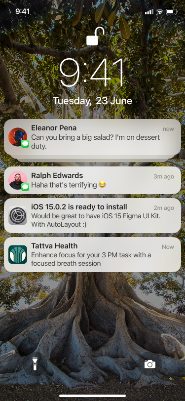
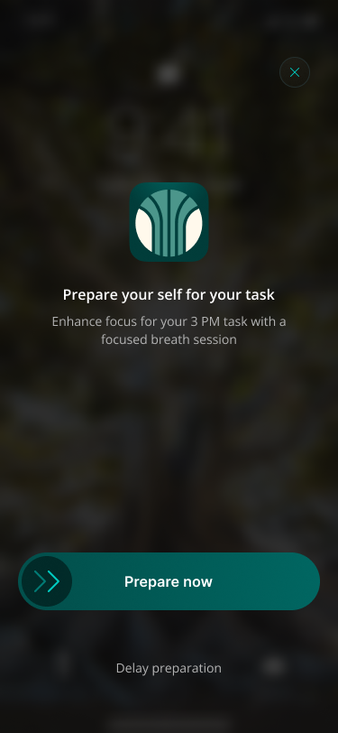
Context-aware session prompts tied to calendar events: the practice surfaces at the right moment, already calibrated.
The founders had built a community in the physical world first, and the app needed to carry that forward: shared practice sessions, group challenges, a place to connect around shared experience. We integrated retreats as bookable experiences and built community around them, before and after.
Community and retreats: group practice, shared progress, and in-person events integrated into the same experience.
Tattva has since narrowed its focus to cardiovascular health, as early-stage scopes tend to do.
What stayed with me from those three months was the work of a very early idea: learning the space, and in this case the science, as deeply as the people building it, and working as an equal collaborator in shaping the product.
“Individually, we are one drop. Together, we are an ocean.”
— Ryunosuke SatoroThanks to Alfy Backer and Pranesh, who worked with me on this.
“Working closely with Aishwarya on Project Tattva was an absolute privilege. She possesses a rare blend of exceptional storytelling and collaborative energy, bringing clarity and structure to even the most complex design challenges. Every decision she makes is backed by deep reasoning and clear intent, which was pivotal in visualizing our unique 0-to-1 product from the ground up. Beyond her craft, her ability to engage and manage clients is outstanding—she built instant trust and consistently left stakeholders impressed with our deliverable. Any team would be incredibly lucky to have her leading the way.”
Alfy Backer“If there’s one thing Aishwarya can do better than most designers I know, is the way she presents her ideas, it’s backed with so much clarity and thoughtful reasoning. I’m genuinely impressed by the way she handles client feedback.
We conducted a brand identity workshop together and it remains one of my favorite collaborations. She puts serious effort on every piece of work, the end result always feels so complete.
Aishwarya is a highly skilled Product Designer, who brings a mix of creativity, strategy and professionalism to the table.”
Other projects