Case study · iMocha
From test scores to skill clarity
Overview
iMocha is an HR-tech platform enterprises use to run skill assessments. Over a year, I drove UX for its pivot into skills intelligence: a continuous view of which skills exist in a workforce, at what proficiency, and where the gaps are. The work split two ways: employees growing their skills for career advancement, and organisations gaining visibility into workforce skills to improve ROI.
Assessments happen a few times a year. Understanding skills is something an organisation needs all the time.
How can a platform built around taking tests become the place where employees and organisations understand skills?
Starting with what existed
We started with a heuristic analysis of the current product. Navigation split a single linear flow across three separate tabs. Copy used internal terminology unfamiliar to users. Related actions lived in disconnected parts of the platform, and progress from one assessment connected to nothing else on the screen.
The platform was built around taking tests; we wanted it built around understanding skills.
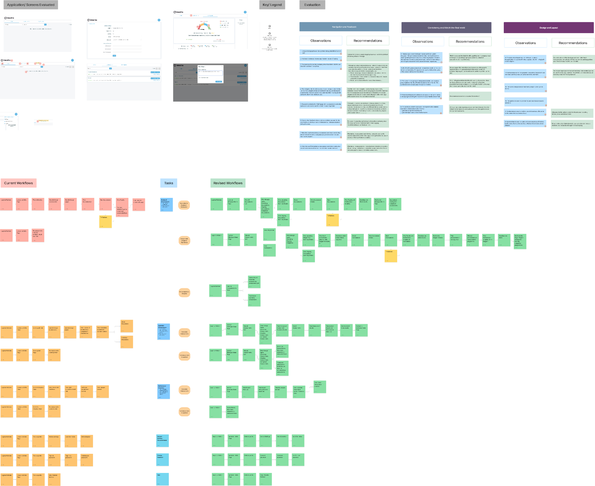
Heuristic analysis of the existing platform, mapped across navigation, copy, and information hierarchy.
The direction we almost shipped
With limited user access early on, we built proto-personas and ran a workflow review, then moved into design. Our first homepage direction centred on engagement, which some stakeholders had asked for: leaderboards, a question of the day, game mechanics. If taking assessments is unpleasant, make the experience less so and bring people back more often.
We presented it. The CTO’s response was quiet and direct: employees wouldn’t spend more than 6 to 8 hours a year on this platform.
That was the number. Everything we had designed assumed far more than that.
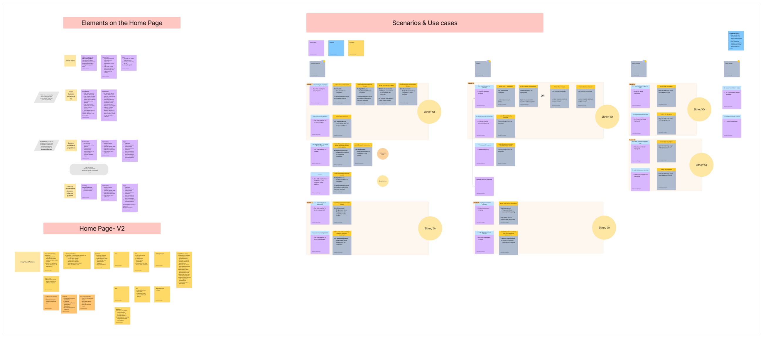
Early homepage explorations, built around return visits and active engagement.
Designing for 6 to 8 hours
No gamification makes a hard Python test easier, and wrapping assessments in game mechanics risked the thing iMocha was trusted for: accurate results.
The goal changed from increasing time on the platform to reducing it: make understanding your skills as fast and clear as possible, so users can get in, get what they need, and move on.
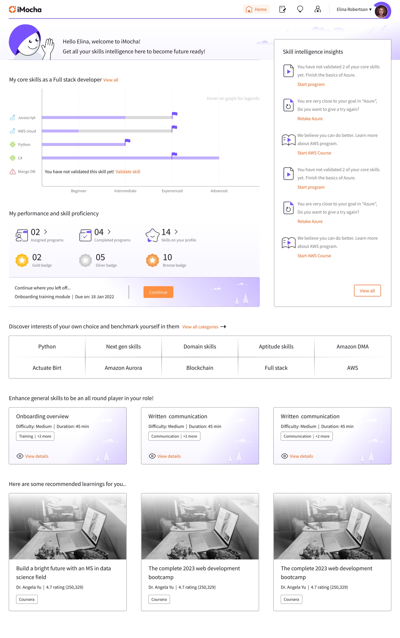
We rebuilt the homepage around that: skill information visible immediately, clear next steps, and progress tracking that required no digging. It took several iterations to get the hierarchy right.
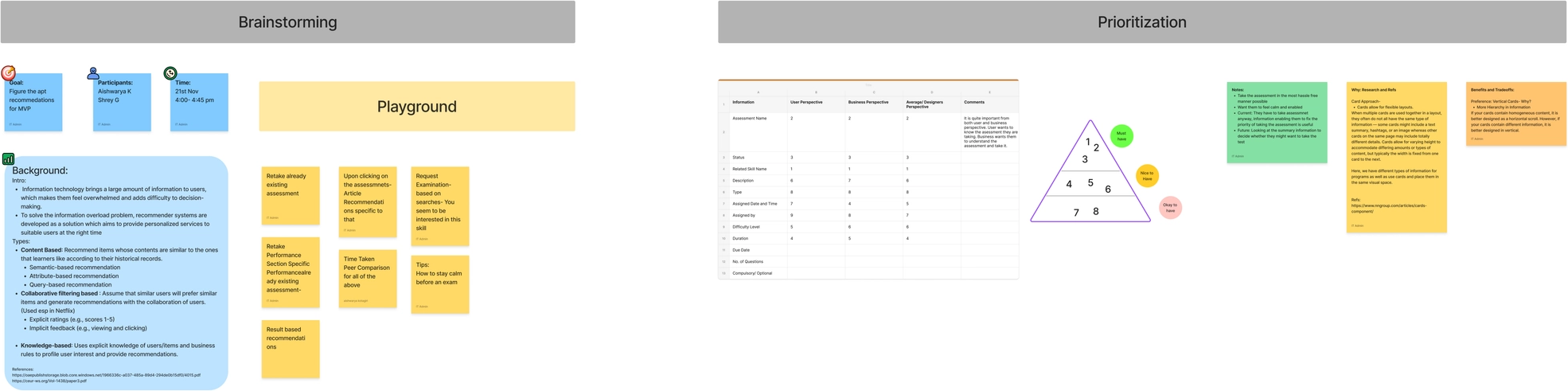
Brainstorming and prioritisation with the team: which recommendations, and which information on an assessment card, earn their place in the MVP.
You are more than your score
Through user and expert interviews, one thing kept coming up from employees: they didn’t just want to know their test results. They wanted to understand where they stood, what they were good at, and what to do next for their own careers.
That became the skill profile: a personal space inside an enterprise product, centred on the employee rather than the organisation’s view of them. It organised each employee’s view of their skills around three questions: where am I now, how do I compare to my peers, and what should I focus on next.
For the MVP we kept the profile focused: skill gap analysis across core, future, and soft skills; benchmarking against the market; and growth over time. We designed career path mapping and internal mobility as a north star for later phases.
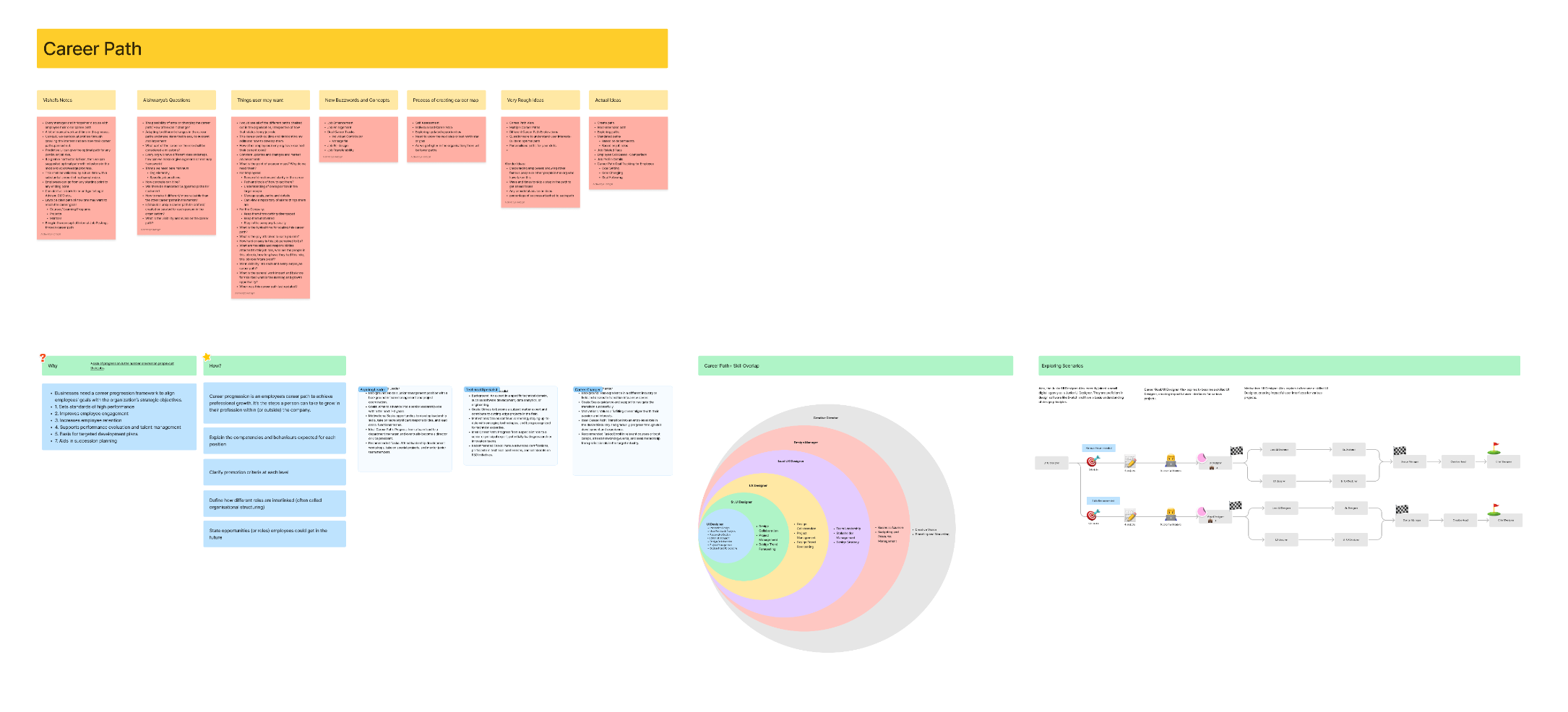
The career path workshop: role and skill overlap, progression scenarios, and the questions behind the north star.
Designing for the organisation
For the second half we went back to interviews, this time with HR managers, L&D leads, and department heads. Their questions were different from the employees’. How is proficiency in a skill defined, and is it consistent across teams? What skills are our teams weakest in compared to the market? Are we preparing for the skills we will need next?
We distilled these into the three areas that structured the admin product. Skill Understanding: what a skill means, how it relates to others, how proficiency is defined. Skill Awareness: what skills exist in the organisation, who has them, how they are changing. Skill Knowledge: what skills matter most, when, and why.
Skill Understanding
- Does “x” skill mean the same things across the platform?
- How does one skill relate to one another?
- Different skill requirements for each role?
- What are the levels of skill proficiency?
Skill Awareness
- Skills that the employees have?
- Skills that the company has?
- Skills teams and departments have?
- Skills growing and reducing over the years?
- How accurately are companies monitoring the skills?
Skill Knowledge
- Skills required for an organisation?
- Skills important for the future?
- Trending/ buzzing skills right now?
- Skills required for certain situation triggers?
Three-tenet framework, drawn from admin research, as the organising logic for the admin dashboards.
What to build first, and what to point toward
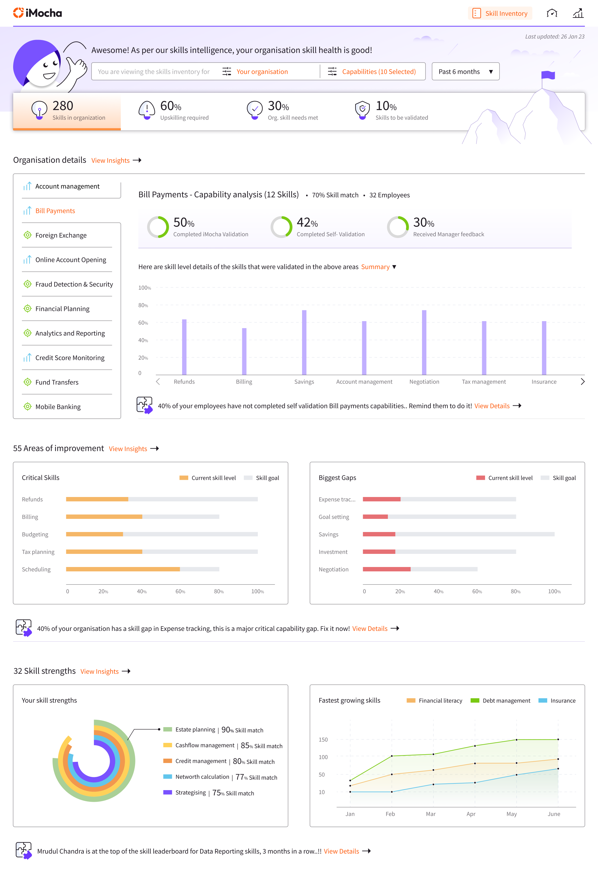
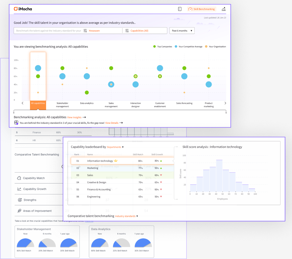
The skills inventory dashboard gave admins a single view of their organisation’s skill health: gaps, proficiency distribution, and benchmarks against industry and competitors. The skill management dashboard went further, covering skill configuration, custom naming conventions, criticality scoring, and development roadmaps.
We also designed the more ambitious version: dashboards that could answer precise questions, surface insights based on what an admin was trying to do, and predict skill gaps before they opened. The iMocha team felt it was not the right scope for the first iteration, so we shipped a focused, buildable MVP and handed over a clear picture of the longer direction, giving every future decision something to aim at.
The screens
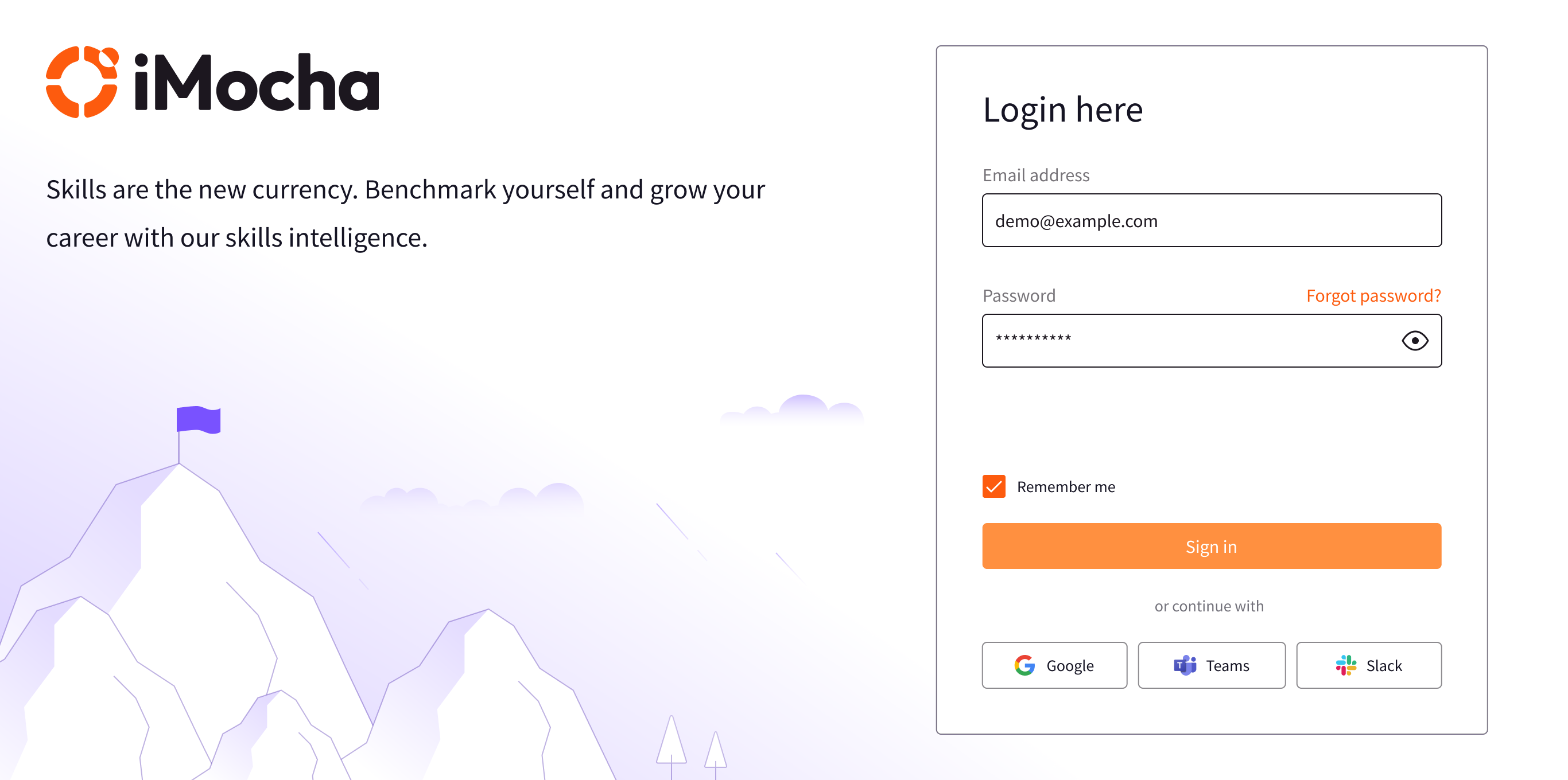
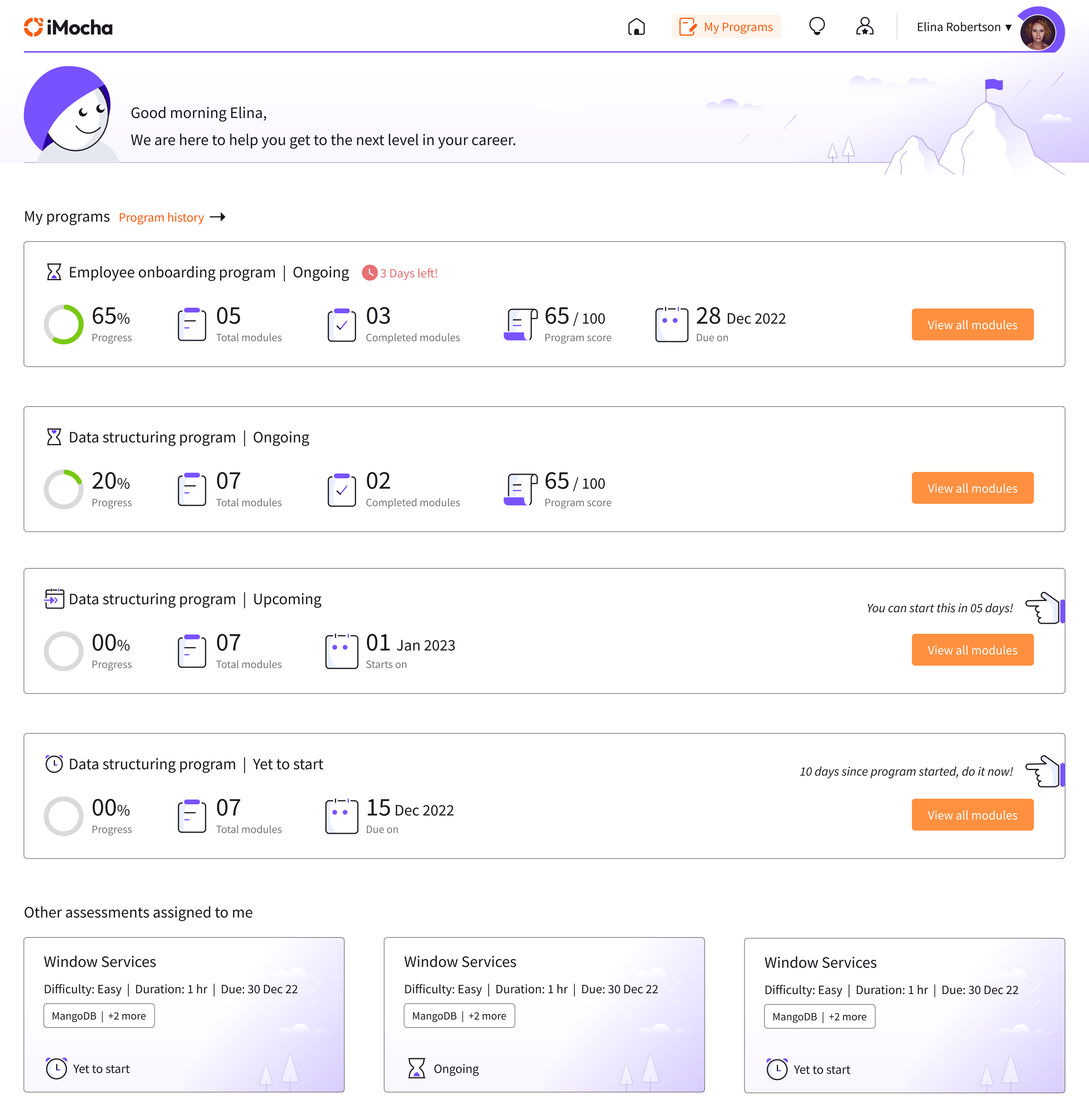
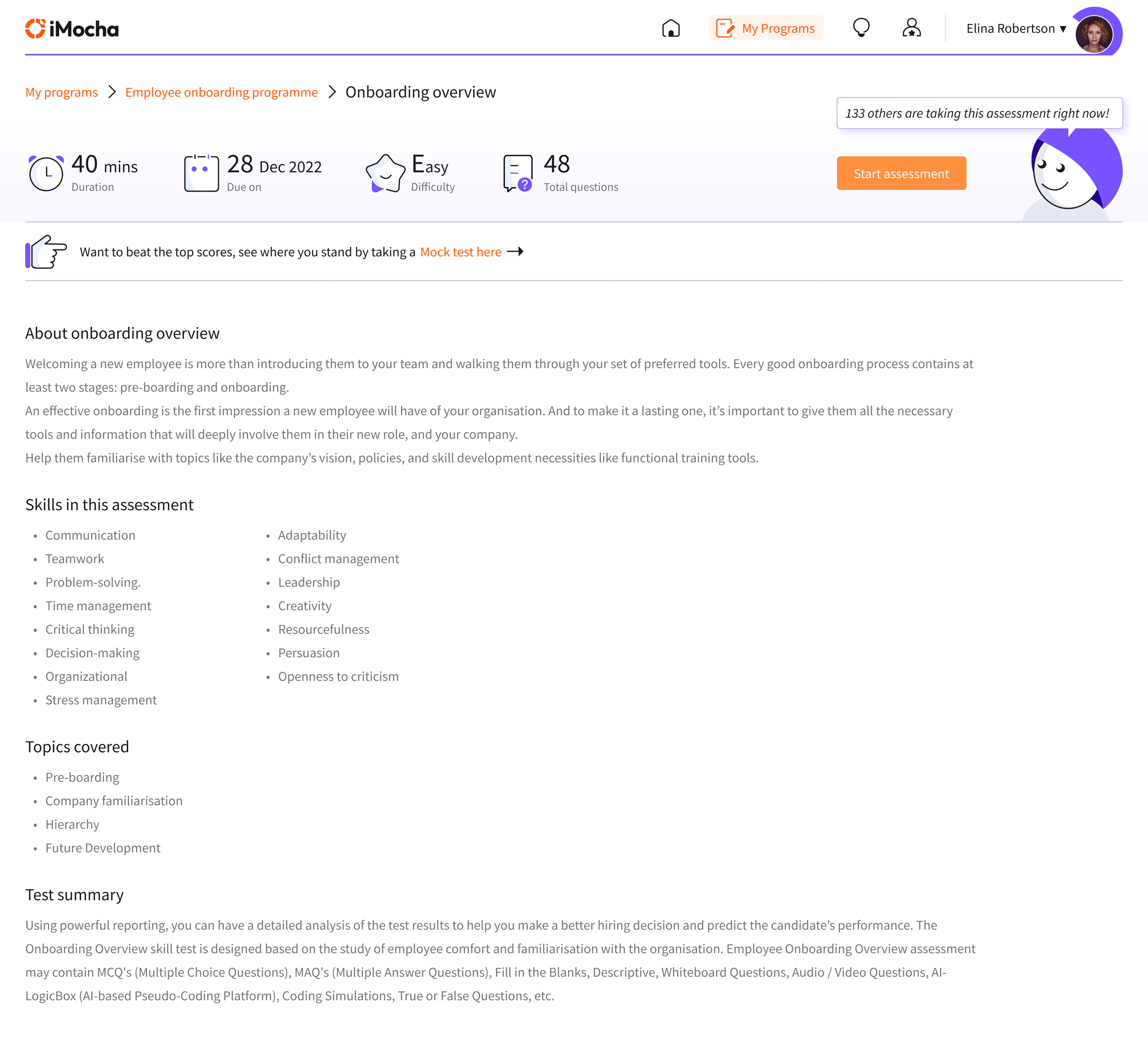
A closer look at the shipped MVP, employee side first.
This was the first project I handled solo. After six months of work on the employee portal, iMocha extended the contract for another six months for the employer side. I did not realise the significance of that at the time. I do now.
“None of us is as smart as all of us.”
— Ken BlanchardThanks to Anurag Vaidyanathan and Vishal, who worked with me on this.
“On the iMocha project, Aishwarya consistently asked thoughtful questions and took a proactive approach throughout the design process. She always looked beyond the UI to understand the problem, bringing strong design thinking and product thinking to every decision.”
Anurag Vaidyanathan · Senior Interaction DesignerOther projects